This site by Harvard University – Atlas of Economic Complexity – provides a unique data visualization portal for international commerce. It is possible to visualize trade between countries and dig into the data in an incredibly interactive manner.
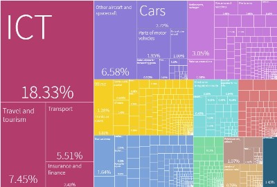
It not only provides a view of the current export / import of each country, but also provides a view over time which allows to see how the weight of each product type changes with time.
I encourage you to spend some time going through those numbers. Once can realize up to what level international trade is developed and every country trades with every other country. The world is open and international exchanges are the lifeblood of the economy. We are not any more in the 19th century where each country was more or less self-standing even if already at that time, international trade was the source of wealth for multiple industries!
