I love this initiative from an Australian University: Sans Forgetica, the font that is scientifically designed to help remember courses: see the Sans Forgetica page.
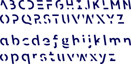
“Sans Forgetica is a font designed using the principles of cognitive psychology to help you to better remember study notes. It was created by a multidisciplinary team of designers and behavioural scientists.”
The interesting part I find is that “Sans Forgetica is more difficult to read than most typefaces – and that’s by design. The ‘desirable difficulty’ you experience when reading information formatted in Sans Forgetica prompts your brain to engage in deeper processing.”
By making harder and longer to read and understand, it seems that we remember better. I find that is quite an interesting insight. It shows that it is important to spend sufficient time reading and processing what has been read to better remember.
