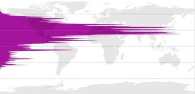
This interesting set of maps accessible at ‘Pop by Lat and Pop by Long‘ demonstrate how the northern hemisphere is vastly more populated than the southern hemisphere.

Of course the peaks for China and India are quite visible, as well as the US population. The epicenter seems to be around 30°N.
The map also reveals how Europe is quite an exception being more northwards than the major population centers.
There can be several explanations for this fact. The first is that average temperature in Europe is higher than it should be based on latitude alone, thanks to the Gulf Stream current. The second is the offset created by India and China populations which are located significantly more to the south.
The fact that there is much less population in the southern hemisphere is also an important observation which explains why many services and calendars are dominated by northern hemisphere considerations.
